29 Dec 2022
As a software engineer, the manager you work under can greatly impact your job satisfaction and career growth. My first job in tech, back in 2016, was a small real estate startup in Philly where I was paid $14 per hour and provided free housing through the PennApps Fellowship. At the time, I thought I had hit the jackpot - I was able to work directly with the CTO on various tasks and learn a lot about different aspects of software development. However, I soon realized that my manager was not invested in my growth as an engineer. He gave tasks with unclear metrics, provided little guidance or mentorship, and simply wanted the tasks completed, rather than caring about my learning and growth.
Since then, I have worked at several companies and have had the pleasure of working with amazing managers and leaders. Comparing my experiences, I realized that a great manager can make all the difference in your job satisfaction and career growth. In contrast, a bad manager can stunt your growth and make your job unpleasant.
Characteristics of a Great Manager
- Receptive to Feedback: Great managers listen to and consider the feedback of their team members. They are willing to make changes based on this feedback, rather than ignoring it or always following their own path forward.
- Advocates for Their Team: A great manager cares about the success and growth of their team members. They will provide structured guidance and support to those who are struggling, and proactively work to help top performers advance in their careers.
- Challenges Team Members: Good managers give their team members tasks that challenge and stretch their skills, allowing them to take on more ownership and responsibility. They also listen to team members’ career goals and assign work that aligns with their aspirations for growth.
- Provides Clear Metrics and Focus Areas: Great managers set clear guidelines and metrics to help team members work efficiently and effectively. They match business needs with team members’ skills and give them opportunities to exceed expectations.
- Offers Mentorship: A good manager values the professional development of their team and offers mentorship through regular 1:1 meetings. These meetings provide a safe space for team members to discuss their careers, areas for growth, and any wins or promotions.
In my experience working at companies such as Amazon, GitHub, Etsy, and Alpaca, I have learned the value of having a great engineering manager. They can truly make all the difference in your job satisfaction and career growth.
30 Aug 2021
It’s been a few months since I graduated from UC Berkeley.
Looking back, one of my proudest achievements was building the nonprofit student org Connect@Cal with my friends during my last year of school.
I think one of the most impactful programs we built was our resource matching system.
We first started with a simple MVP where users would fill out a Google Form and we would email back each respondent with a personalized list of resources based on what we could find in our custom database. Throughout the first few months of testing, we conducted focus groups and looked at our own analytics to see what users valued the most.
Here were some key takeaways we had:
- The main way people find resources is through word of mouth from their friends.
- Hearing how a resource is used by a friend contextualizes how the resource can be used by people
- Hearing from a friend lends credibility and makes it more likely for them to actually use the resource.
- Sometimes people don’t know where to start or what to search for when trying to figure out what they want to do in college.
- A key thing for students during college is discovery: finding their passions and interests. How can we aid in this discovery phase for students?
- For example, I might be interested in building tech with a focus on social impact. I might be interested in a variety of clubs, research, or professional frats. Which sort of organization would be the best fit for me? We found that this was dependent on a variety of factors including your background, experiences, and motivations.
From there, the business teams worked on developing a robust tagging methodology. The tech team built a few algorithms and tools that helped students discover resources more efficiently and helped speed up our internal resource matching system.
In my next blog article, I’ll talk about how we built these tools and systems.
12 Sep 2020
A few months ago, Johnny Nguyen, Eric Cheng, and I created a nonprofit student org that helps connect personalized resources with students called Connect@Cal.
Our mission is to connect every student to the right resources at the right time.
We believe that the overabundance of information, siloed resources, and the state of UC Berkeley’s support system have inhibited students from achieving holistic wellness on campus. Our program will serve as a trusted resource hub connecting students to the most relevant services and programs.
Right from the start, we wanted to create an intuitive and efficient system that helps our users easily articulate their needs as well as quickly receive personalized resources. To achieve this goal, we focused on both designing an intuitive experience for our users as well as building tools for our team to help them support our users.
For our user experience, we wanted to design it so that when a user lands on our webpage, they immediately understand what we do and how they can get the resources they need. For our internal experience, we wanted to create a website that helps our associates effectively identify unresolved cases and correlate information in those cases with our internal databases so that they can create the most relevant and effective response to our clients.
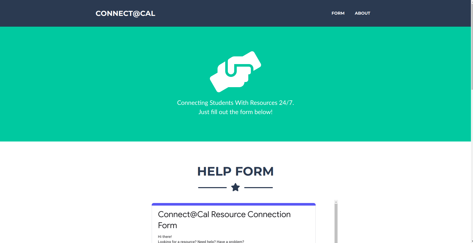
Originally when our tech team was just me and Eric, we quickly built this for our beta site so that we could launch quickly:
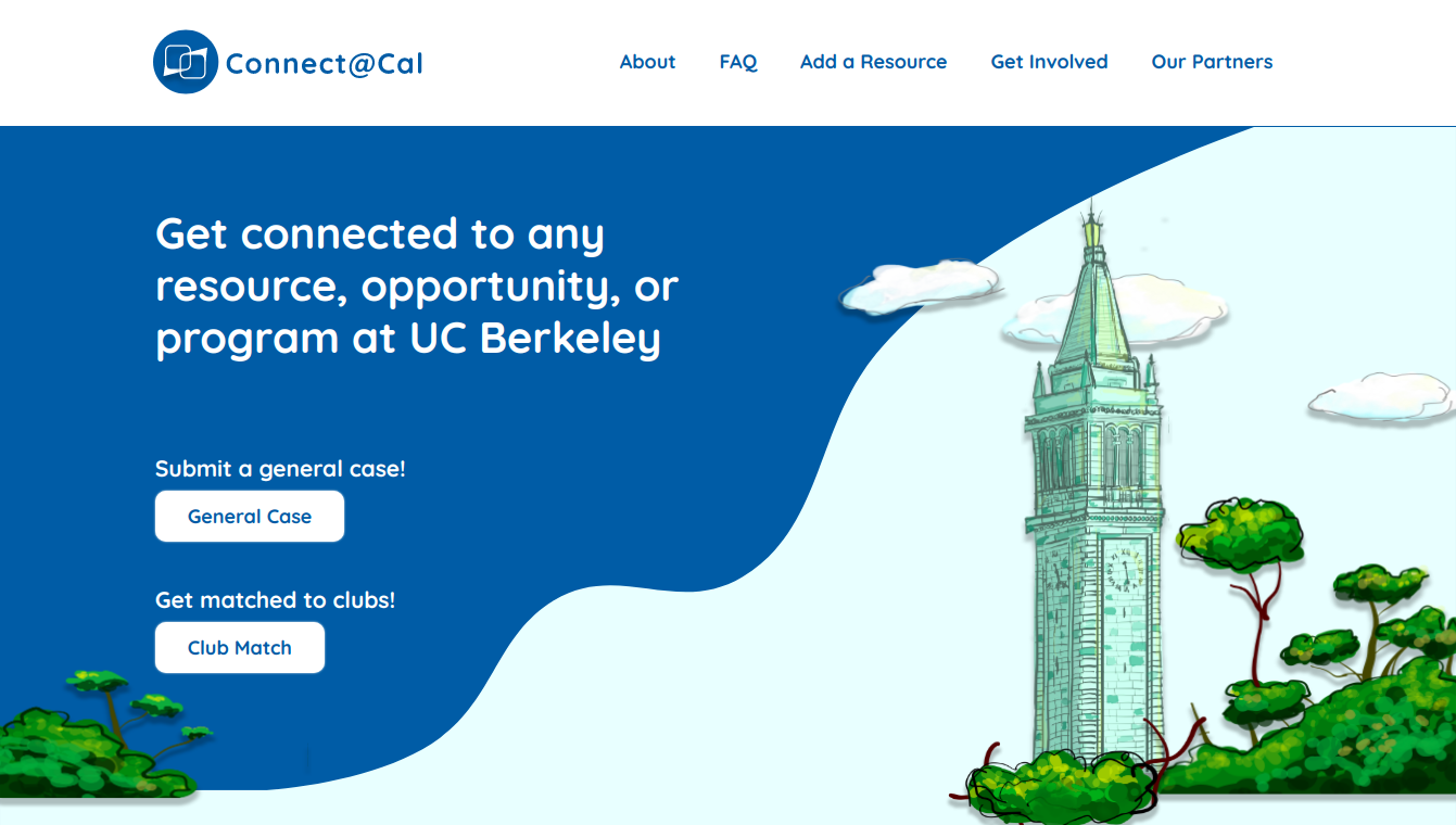
Then, after Dana Feng joined our team, we were able to completely redesign our user experience:
How were we able to accomplish this?
After we launched our original website, we soon realized from our analytics that users weren’t using our platform for our intended goal in mind. After meeting with our business development teams, we identified that the main issue with the beta website was that it looked untrustworthy and was not user friendly. So, we created a user workflow diagram that maps out how various users could interact with our website to figure out what we needed to change as well as build for our website:
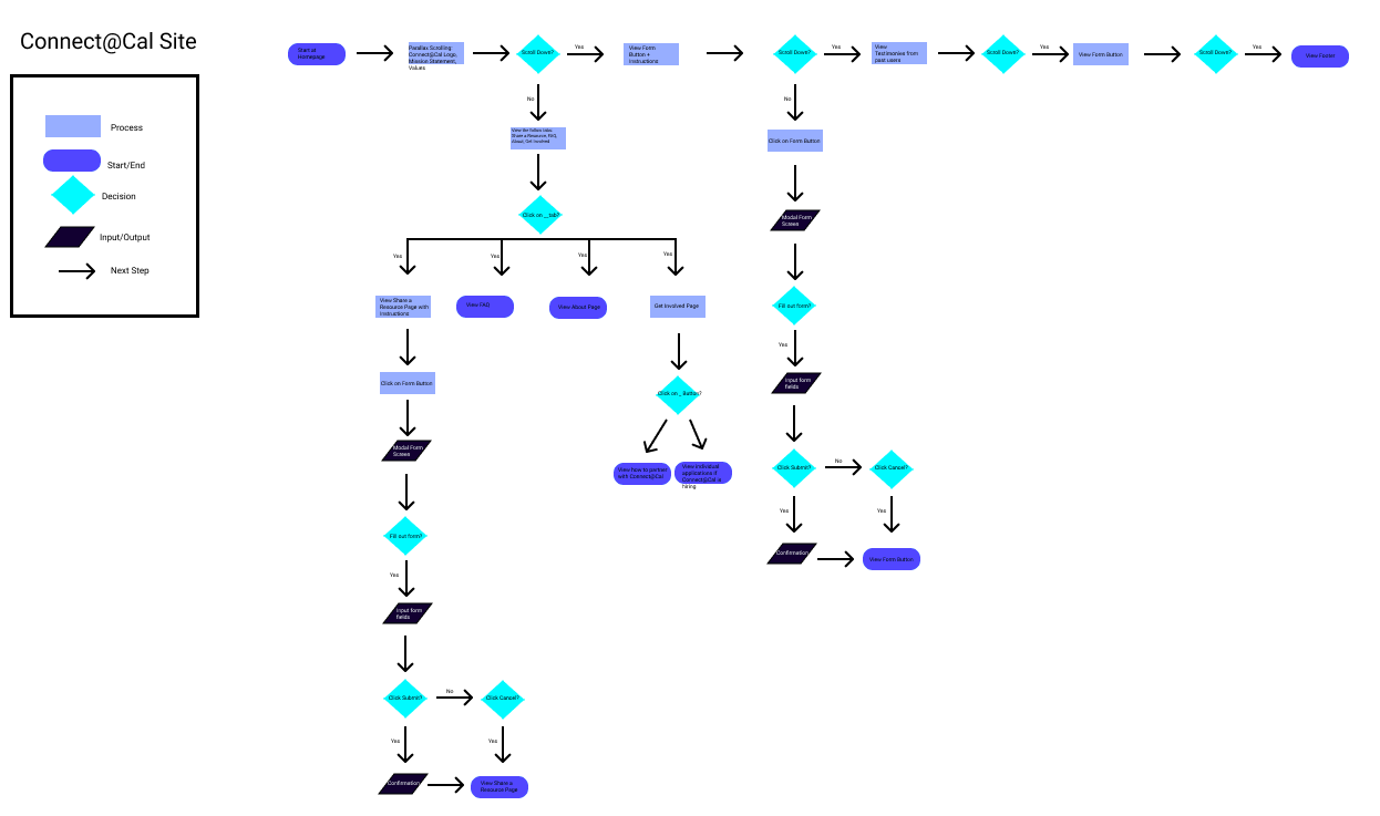
After we understood the various paths users took on our website, we created high fidelity mockups of our user website so that we could continuously experiment and visualize different approaches for features we wanted to build:
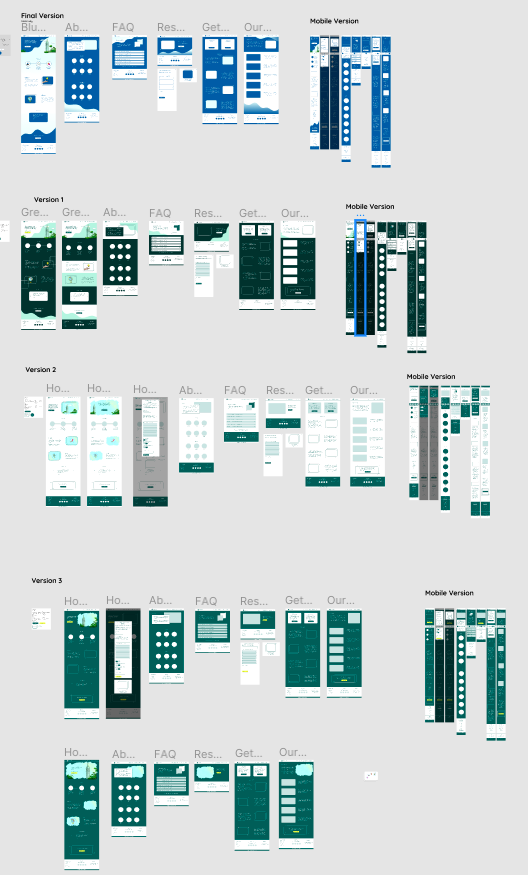
Lastly we wrote the website code, tested it out on mobile and desktop devices, and then launched it 🚀. Over the last few weeks, we have been able to steadily decrease our bounce rate by 3% weekly while also increasing our amount of cases by ~10% weekly.
Throughout this redesign, we learned that process matters.
Oftentimes, when we feel really passionate about a problem, we jump right into building a solution without walking through every possible user path. By taking a step back and revisiting how the user uses our platform, we were able to check our own assumptions of what users want and figure out the potential holes within our existing model and fix them. Afterwards, we explicitly constructed mockups before coding out our website. If we didn’t have mockups before, we could have inadvertently left out important user feature(s) as well as potentially created code that would have never been used. Having a structured and systematic process of redesigning our website helped us create the best possible website for our users while also enabling our tech team to work efficiently.
Connect@Cal’s north star is to create the most effective platform for students at Berkeley to find relevant resources that will help them find their communities, calling, etc. As learned throughout our redesign process, we need to continue to create structured processes to ensure we are producing the highest quality features that users want and need.
If you interested in hearing more about Connect@Cal, follow our Instagram and Facebook to stay posted on our upcoming partnerships and projects!
In my next blog, I’ll talk about how we redesigned and built from scratch our internal tools which allow our associates to effectively identify resources for students! In the next few months, keep your eyes out for even more blog posts on our new features such as our upcoming chat bot.
22 Dec 2019
A few weeks ago, for CS 61B, we had a project where we were supposed to recreate the game Tablut. For part of the process, we had to develop an AI for both the black and white sides in the game. The week prior to that we learned about the Minimax algorithm which is very beautiful and powerful despite its idea being quite simple.
In this blog post, I’ll explain how I built an AI for the Tablut game that uses the minimax algorithm as well as explains the use cases and efficiency of the algorithm.
What is Tablut?
Tablut is an ancient Nordic and Celtic board game that starts with this layout:
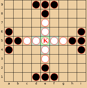
The basic gist of the game is that both white and black pieces can move any distances within the board orthogonally as long as there are no blockers in the way (similar to a knight piece in chess). For the white to win, the white side has to move the king to the end of any of the edges. For the black to win, the black side has to capture the king. Both black and white pieces can capture the other piece if 2 of their pieces sandwiches the opponent’s piece. A capture results in the sandwiched piece being removed.
For more info and additional rules, check out: http://inst.eecs.berkeley.edu/~cs61b/fa19/materials/proj/proj2/index.html
What is the Minimax Algorithm?
For part of the Tablut game, we were tasked to create an AI. A good first start would be by using the Minimax algorithm!
Basically, the Minimax algorithm anticipates a move for a player based on the best possible move for each player after making a certain move. Another way to say this is that this algorithm minimizes “the possible loss for a worst case (maximum loss) scenario”.
In general, to use the Minimax algorithm, we do the following:
- Create a heuristic function that takes in an input (ex: the board) and evaluates how valuable a move it. For example, we could say that the lower the value, the better the value is for one side; the higher the value, the better the value is for the other side.
- Construct a Game Tree which is a visualization of possible moves for a game.
- Each edge represents a move and each node represents the value after the moves from all the nodes from the bottom.
- For example, let’s say we have the game tree as follows where the squares represent the heuristic score after the opponents move and the circles represent the heuristic score after our move. The higher scores favor us and lower scores favor the opponent:
 We start from the top which is going to be our move (the node value is unset for the moment). Then, the next layer represents all the possible moves stemming from our move. We calculate what possible responses there are to the move on the top. We keep traversing all the way to the bottom. The bottom layer represents all the possible moves for our current board. The layer above that represents all the possible responses to our moves. Then, we statically generate the score for each of the node values for the bottom and we follow the Minimax algorithm. At the bottom level node values at first (0, 5, -4, 1, -3, 3, 0). At the bottom depth, we select based on what is optimal for the player. So say we are at depth 2, with the circles, we select 5, 1, 3, and 6 since those are the maximal values of the children. At depth 1, we assume the opponent will select the minimal values of the children so 1 and 3. Finally, we are at depth 0 and we select the maximal value of the children.
Here is a gif which may be more intuitive:
  .
Also, here is a good visualization of how the Minimax algo works: https://www.youtube.com/watch?v=zDskcx8FStA.
More specifically, for our case with Tablut, we will do the following:
- Create a heuristic function based on the board. Lower values mean that it’s beneficial to the black player while higher values mean that it’s beneficial to the white player. In our heuristic function we do the following:
- Check King’s surroundings. If the King is surrounded by black pieces, we lower the score since this indicates that the King is closer to being captured. If the King is close to the throne, raise the score since that means the King is more protected from captures.
- Check if the King is at the edge. If so, white has won and we set the score to infinity.
- Check if the King is captured correctly. If so, black has won and we set the score to negative infinity.
- Check the number of black pieces and white pieces (because some pieces could be captured). We add and subtract the number to our score. If there are fewer black pieces than white pieces, we raise the score. If there are fewer white pieces than black pieces, we lower the score.
- Create the game tree and recursively find the best move:
- If we meet either of our base cases, we return the heuristic score of the board. Our base cases are: 1) we have hit our recursive depth limit (which we arbitrarily set at 3) and 2) there is a winner based on the board layout.
- We start by finding all the possible moves given the current board layout.
- For each of the possible moves:
- We make the move.
- Given the board that has just changed from the move, we recursively call our function which is step (2) with this new board. The value of the recursive call to the function of step (2) is assigned to the variable responseScore.
- If the responseScore is the largest we’ve seen, we record the move to our private global variable _lastFoundMove.
- Return the best possible move for the AI (_lastFoundMove).
This is how it looks like in code (gist):
Optimizing our algorithm using Alpha and Beta Pruning
As you can see, running the Minimax algorithm will take quite a bit of time to run since we are going through each possible move and going through each response to each of those moves, etc.
One key observation we can make about the Minimax algorithm is that we can short circuit some of our decisions.
 (Source: https://en.wikipedia.org/wiki/File:AB_pruning.svg)
Before we start, we assign alpha to negative infinity and beta to infinity. Alpha represents the minimum score that the player who is maximizing will get. Beta represents the maximum score that the player who is minimizing will get.
In the tree example above, we start after the initial values at the bottom are generated (5, 6, 7, 4, 5, 3, etc.). We proceed from left to right. We prune when alpha is greater than beta.
Thus, we proceed as follows:
- We start at depth 4 with the values 5 and 6.
- We evaluate the min(current minimum, current value) since we are trying to minimize it. Then, we will update the node above to the minimum value.
- At node 5, min(5, infinity) equals 5. Minimum = 5. We also check if alpha > beta (so 5 > infinity) to check if we need to prune the branches to the right.
- At node 6, we evaluate min(5, 6) is still 5. We also check if alpha > beta: 6 > infinity.
- We carry this value all the way up as we backtrack. So at depth 3, beta is set to 5. At depth 2, alpha is set to 5. We go back down to depth 3 and finish evaluating that subtree.
- We go to the next set of values at depth 4: 7, 4, 5
- Alpha is set to 5 at the moment since it inherits that value from the parent.
- At node 7, the current minimum is 7. Alpha is still < beta: 7 < 5.
- At node 4, we get min(7, 4) which is 4 so the current minimum is 4. Alpha is > beta: 5 > 4. So, we start pruning and we don’t consider node 5! Why don’t we care about any of the values to the right? We know that the parent node will be <= 4 (since we are minimizing) which is < 5. When we backtrack up to depth 3, we won’t care about this tree’s value since we already have the 5 value to the left which is > 4.
- We go to the next tree and follow a similar process. 3 trickles up to the node at depth 2 because at the bottom alpha < beta (3 < 5) and when we backtrack, alpha < beta.
- We continue this process until we get the top value.
- Note: the reason why we don’t traverse the tree with the node value of 8 at depth 2 is because alpha was greater than beta (6 > 5) in the tree to the left of it.
In the gist above, I’ve incorporated alpha and beta pruning.
What’s next?
There are many other algorithms that could work better for Tablut. I chose Minimax because it seems to be the most common approach for building AIs for chess (https://stackoverflow.com/a/2026339/4698963, https://www.quora.com/Is-there-a-better-game-algorithm-than-Minimax-for-playing-chess) and was a good algorithm to learn at first for game decisions. I’m still a newbie when it comes to AIs in games but I plan to explore the Monte Carlo Tree Search.
Sources
http://inst.eecs.berkeley.edu/~cs61b/fa19/materials/lectures/lect22.pdf
http://inst.eecs.berkeley.edu/~cs61b/fa19/materials/book2/data-structures.pdf
17 Sep 2019
“We don’t want students to suffer from GPS Syndrome”
A few weeks ago, I went to the orientation for Academic Interning for UC Berkeley’s CS61A course.
One of the most surprising and enlightening parts of the sessions was when one of the CS61A TA’s went over the concept of GPS Syndrome. He explained that often times students ask a lot of questions when they get stuck and ask you to give them the steps and eventually the solution to a problem. He compared this with his experience using a GPS system while navigating Berkeley. Since he had always used a GPS to get to places, he never learned how to truly get around Berkeley without a GPS.
Often times, when you give a student too much help and guidance, they become dependent on you and don’t develop the skills and problem solving mindset to tackle programming problems in the long term.
Before this orientation, I’ve always thought that as a teacher, you should teach a student as much as possible and hold.
After going to this orientation and reflecting back on my own experiences, I’ve realized the best teachers and mentors I’ve had in programming gave me space and gently pushed me to solve problems by myself if I was asking “too many” questions. Most recently, in the beginning of my internship at Etsy, I had a training lab and I remember struggling with a certain section for a few hours. I asked one of my team members to help me. Instead of giving me the answer, he asked me what my approach was. Throughout that process, I realized some holes in my approach and moved forward to solving those issues. Still, after a few more hours, I asked the same team member what was wrong with my code. Instead of telling me specifically what was wrong, he taught me the best ways to debug my problem with the Chrome debugger and various tools built into the Etsy Codebase. I’m super glad he taught me how to tackle the problem instead of just telling me solely how to solve the problem. I was able to use those debugging skills for the rest of my internship and it helped enable me to learn and work more effectively overall.
For the past 2 weeks, I’ve been answering various questions during a weekly CS 61A Lab during my CS 61A Lab. During my first week, I had the opportunity to help combat against the GPS Syndrome problem. I had one student ask me what the solution was for one of the lab questions. He told me he didn’t understand at all why his approach was incorrect. Instead of giving him the answer directly, I asked him how he approached the problem. From his explanation of his approach, I realized that he misunderstood what the problem was asking for. So, we walked through a few different examples of the function and he slowly understood what the problem was with his code and realized he didn’t understand the problem completely before he started writing the code! Moreover, I made sure he understood how his old code operated and ran in Python using environment diagrams.
I gave him a few minutes to rethink the problem over and try solving it. When I came back after 5 minutes, I was surprised that he used a concept that they hadn’t learned yet, recursion, to solve the problem correctly. He walked through his thought process with me and excitedly explained why he “called the same function in the function”. What really amazes me about the approach of giving students enough space (after giving them the tools to succeed) is that these students often times are able to grow and learn more by themselves as well as expand on course material beyond what is being taught!
Learning this GPS Syndrome concept was super interesting and eye opening for me. I’m super excited to find out what I discover next throughout my teaching experiences through learning more about effective teaching methods and tutoring several students weekly via CS 370 (a course on teaching CS), teaching CS 61A weekly as a Computer Science Mentors, and answering questions in CS 61A lab via an Academic Internship.


 We start from the top which is going to be our move (the node value is unset for the moment). Then, the next layer represents all the possible moves stemming from our move. We calculate what possible responses there are to the move on the top. We keep traversing all the way to the bottom. The bottom layer represents all the possible moves for our current board. The layer above that represents all the possible responses to our moves. Then, we statically generate the score for each of the node values for the bottom and we follow the Minimax algorithm. At the bottom level node values at first (0, 5, -4, 1, -3, 3, 0). At the bottom depth, we select based on what is optimal for the player. So say we are at depth 2, with the circles, we select 5, 1, 3, and 6 since those are the maximal values of the children. At depth 1, we assume the opponent will select the minimal values of the children so 1 and 3. Finally, we are at depth 0 and we select the maximal value of the children.
Here is a gif which may be more intuitive:
  .
Also, here is a good visualization of how the Minimax algo works: